Attention – Houston St.

October 29, 2008

If an advertisement is to grab attention and to hold onto it for a period of time, this sure does it. She’s wearing AA, she’s provocative. It’s one of those grainy, intimate shots I like, and it’s just coy enough to not push any limits.

And if you have any complaints, would you really rather see a bubbly Old Navy commercial or something?

Back of the Van

October 22, 2008

Pulled this from this blog. His argument why he doesn’t like this ad? It’s not creative enough.

I’ve worked in publication, advertising and graphic design. I’ve studied artistic representation and dabbled in it myself. And I’ve seen plenty of stuff that was creative but aesthetically disastrous.

Now, is the point of advertising to be creative? In the midst of his hate for these advertisements, the author of the post writes, “When you see these ads and catalogs, you know it is American Apparel…”

Everything else is secondary. In the above, one of the usual models is used in a provocative pose and the basic newspaper/print premise of big photo/white space has been employed again. This is an American Apparel ad and anybody with a pulse and a modicum of pop culture acumen could point that out. So, tell me again why these fail to do the job that they’re supposed to do?

Advertising is supposed to translate into sales and brand recognition. If you want to win awards for creativity, go back to art school.

Monocole Magazine

October 21, 2008

This American Apparel ad was found by Alex Johns in “an old issue of monocole magazine”. It’s not the typical style and it might be why I like it. But the colors definitely help. It’s one of the more artistic ads I’ve seen from them. Part of me is reminded of some kind of my buddy’s senior art thesis, but that kind of amateurish yet artistic charm is what makes it look appealing. The juxtaposition of colors on the stark white background, as usual, never sees to strike me as elegant, no matter what the content of the ad. Basic, minimalist graphic design, but still gorgeous.

American Apparel Ad – Chris w/ Chairs?

October 20, 2008

This is Chris showing off the men’s brief (Sorry that I don’t know what publication it is from. Just got it online).

But I don’t believe it.

I think his real name is Kristoff. He was born and raised in Pristina, Kosovo, and defected in the late ’80s while competing at a chair-lifting competition in Raleigh.

In all seriousness, I don’t get this one. Like I’ve said before, I love the intimacy of the ads, even the washed out brightness and tepid expressions. But this one? It might look intimate, but where does this happen? Is Chris setting up for an upcoming tupperware party? And if he is just moving them, is that the most efficient way of moving FOLDABLE chairs? You’re doing it wrong, Chris. Now go put some clothes on before you catch a cold.

American Apparel Web Ad – The Cool Hunter

October 16, 2008

See the full ad at The Cool Hunter

I’ve been posting a lot about American Apparel print ads because, frankly, the web ads have been fairly uninspired. They’re often colorful, but usually aren’t too eye-popping when compared to their print work.
This is different though. One of my friends sent me this ad on The Cool Hunter today (those screenshots don’t do it justice) and it’s refreshingly unique. It’s integrated with the site and the animation is not nearly as intrusive as the normal ones you see. The staggered stop-motion transitions are a bit odd at first, but the slow dissolve into the typical tagline is nice. On top of that, the sexuality isn’t explicit. It’s certainly highly suggestive, but it’s not tongue-in-cheek or full out pornographic like some.

The thing that I love most about the ad is how it is made specifically for The Cool Hunter layout. They could have just put one ad on one side. If the “Zip It Up, Zip It Down” was what they were going for, it could have been one animation. But how one starts up and finishes only for the next one to continue the narrative, it flows seamlessly on a site that allows for two skyscrapers, at the very least showing a basic understanding of the medium they’re designing for.

The thing about web ads, AA or not, that has always bothered me was the haphazard and reckless remnant placing everywhere you’d go. (I get it, Snorg Tees. You sell ironic and not-at-all-funny t-shirts.) In the past, American Apparel has been a fairly bad abuser of this system too. But this shows an understanding of the site and the audience with an interesting animated ad (which is usually an instant turnoff for me), and I hope they continue to make more like this.

Continuation of ‘Ehh’

October 16, 2008

Just came across this ad online. Looks like it’s advertising for a new store in Glasgow, Scotland, by the print in the bottom left. Either way, it uses the same graphic as the earlier In Touch ad I discussed. I didn’t really like that one, but I like this one even less.

The most fairly consistent thing that I like about AA ads is their intimacy. Sure, this one appears to be intimate, but it’s got those same sort of posed underpinnings. Without any background in the back, it’s no longer Terry Richardson. It’s a cutout of something that’s been taken out of context, and then, suddenly, she looks posed. The blocks of color behind aren’t the same as the split that the other ads formerly employed, which is more interesting. Instead, it comes off looking like a checkerboard of mediocrity.

American Apparel – Outfits For Everyone

October 15, 2008

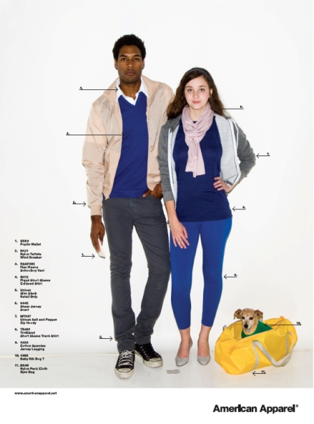
I really, really, really like this ad. Can’t find where it’s from, unfortunately. But it’s really functional, pointing out where you can buy practically everything in the print advertisement. It’s colorful, engaging. Even the dog is looking at you! It reminds me of those old MAD Magazine spreads or maybe one of the fashion ones in Maxim. But not nearly as corny. It’s the same American Apparel style with a very practical twist.

Also, different colored shoelaces on the Chuck Taylors? Don’t know if I could pull that off. Don’t know if he even does. 😛

American Apparel – Tulasi

October 14, 2008

This one is just like the last one. But I like it more. There are two less items in this ad, if you haven’t noticed. Also, this is Tulasi. And I sure do like her. Staring at these things all of the time, she has to be one of my favorites.

In Touch – Micro-Mesh Bra/Men’s Brief/Striped Knee-High

October 14, 2008

I don’t know about the pose. I think it’s like some dramatic representation of the Ancient Greek S-curve. But I like the color and the cutout. The sheen of the bra is kind of disconcerting. But I’d dig this in a print publication. That pink would definitely catch my attention. Though I doubt I’ll be buying knee highs or bras any time soon.

Eugene Weekly – November 2007

October 10, 2008

There’s something very base but awesome about the way that American Apparel appeals to our love of color. Some of them, I could never wear outdoors because people would be wondering why the hell I was in such a bright shade of fuschia. But does it look awesome in advertisements alongside its complementary and outlandish hue counterparts? Definitely.